COOKTIME APP UX DESIGN
Conducted research, developed wireframing and prototypes for a unique cooking app. This project aimed to solve the common problem of attempting to multitask while cooking by helping users consciously optimize their downtime.
CLIENT Student Case Study / ROLE UX Designer / Fall 2019

Problem Space & POV
A 2017 study found that eating more home cooked meals was associated with better health in adults. However, people are living busier lives than ever, and are often limited on time, ingredients, and other resources. We sought to explore deeper, and produce an app experience that would improve the cooking experience for users.
POV: A busy working professional comes home and needs to prepare a meal with little time and few ingredients.

Design Process
We followed the IDEO design thinking approach in an effort to understand our user and continually improve on our ideas
Ideation & “How Might We” Statements
In order to be sure we identified the proper solution we started our process with a thorough brainstorm, using “How Might We” phrases as a way to turn our challenges into potential opportunities.
Hypothesis
We believe that creating a database of recipes based on prep and cooking times will allow busy home cooks to fully utilize and maximize their time by integrating other activities into meal prep.

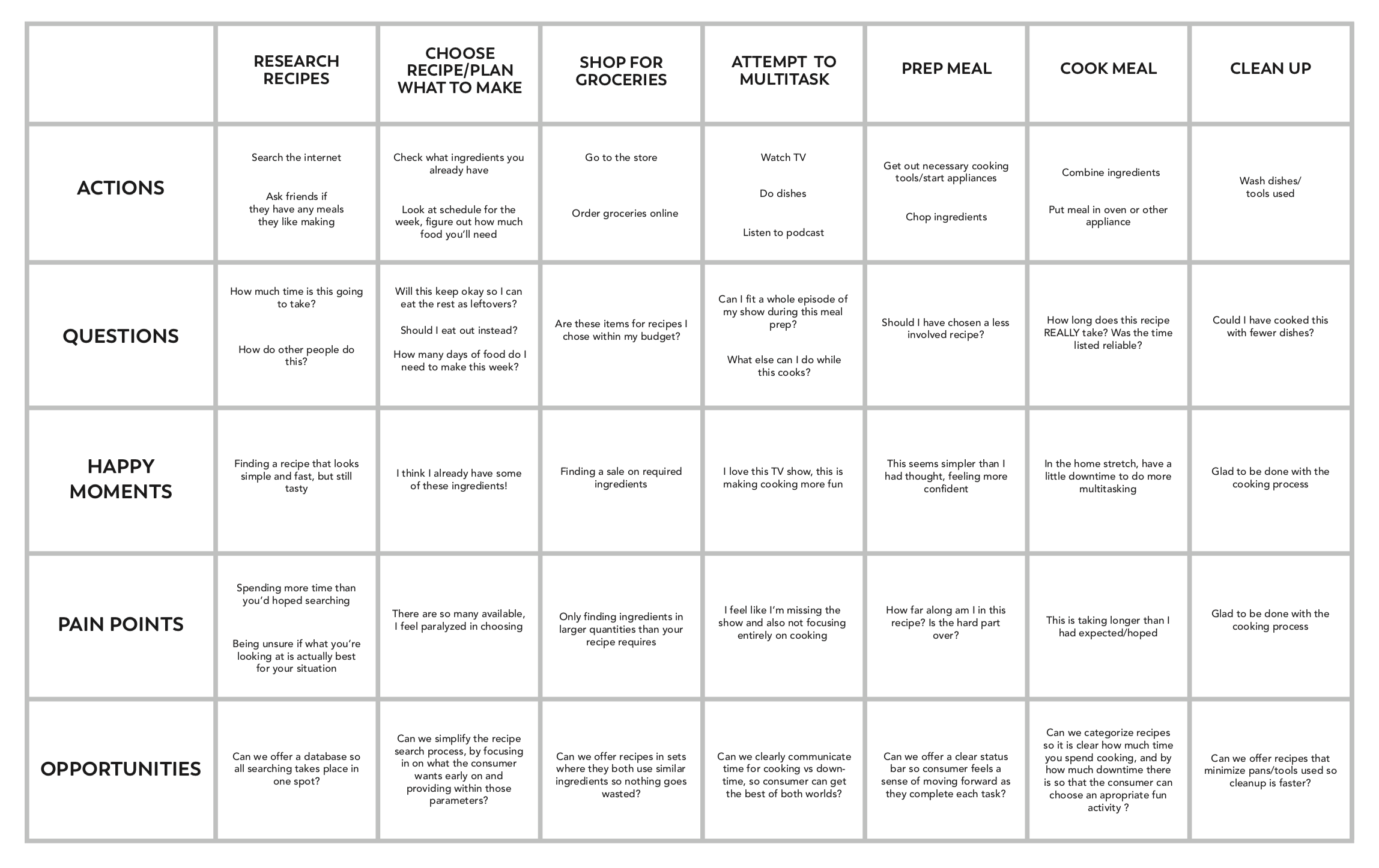
User Needs / Empathy Map
To help flesh out user needs and current process, we developed an empathy map. This allowed us to further understand the experience of the user in its current state, by ideating around what they would say, think, do and feel.


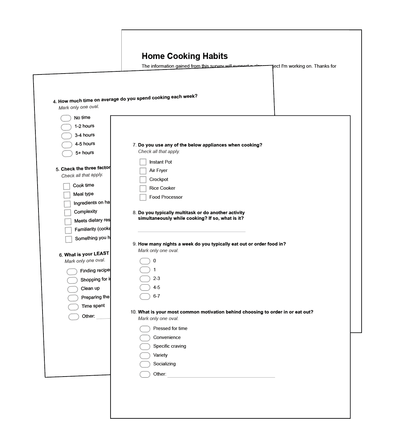
User Research Findings
In order to gain more insight into users and their habits, we created a survey. This allowed a few clear trends to arise, which shaped the direction of the project. We asked basic demographic questions, as well as questions about people’s cooking habits and preferences. We included a variety of prompts allowing us to get qualitative and quantitative data. Some key findings are below:
Over 85% of those surveyed cook meals at home.
2. The top three factors in how users choose a recipe to cook are cook time, ingredients already on hand, and recipe complexity.
3. 72% of users cited multitasking while cooking.
4. 62% of those surveyed cited spending 3-5 hours cooking each week.
5. Preferred multitasking activities included watching TV, followed by listening to music and doing dishes.

Our biggest finding was the high rate of multitasking done while cooking, which lends itself to our hypothesis that cooking “downtime” could be better spent or optimized. It seems people are already drawn to doing this, but perhaps not in the most optimized or intentional way.
It was at this point, based on these findings, that we adjusted our app flow to be a bit narrower and focus in on utilizing downtime in cooking for a variety of ages and reasons. This could include studying, or something purely fun such as being able to fit in a full uninterrupted episode of your favorite TV show.
Competitive Analysis
To further understand user needs we examined both direct and indirect competitors. This helped us see what was already available to consumers, as well as identify white space where we could help deliver on outstanding needs in the category.
We found most food or recipe subscription services currently focus on minimizing time spent cooking, or on directly supplying you with the ingredients needed, specifically saving you shopping time. We did not, however, find any solutions that helped to maximize that saved time. This was an opportunity for us, since most apps currently are just offering more “time” as a benefit, but leaving it as aimless or unqualified.
Additionally, there were things we saw competitors doing well that we took inspiration from in some form. We saw a few apps partnering with other services where appropriate, delegating some of the resourching to services already having success in their specific arenas. Additionally, we saw some apps starting account setup with a lifestyle quiz, an approach that could prove useful to us as we try to onboard users and cater their experience to their specific needs. Diet and food choices are deeply personal and widely varied, and we wanted to try to eliminate things each user will have no interest in early on. If a user is a vegetarian, and we can find that out at sign-up, we can be sure their recipe searches never include meat dishes, flitering out those options without requiring their efforts
Persona Development
To be sure we were meeting the needs of our user throughout this project, we created three behavioral personas to keep in mind as we worked. This helped us keep the user in mind and cater to multiple sets of needs at once.
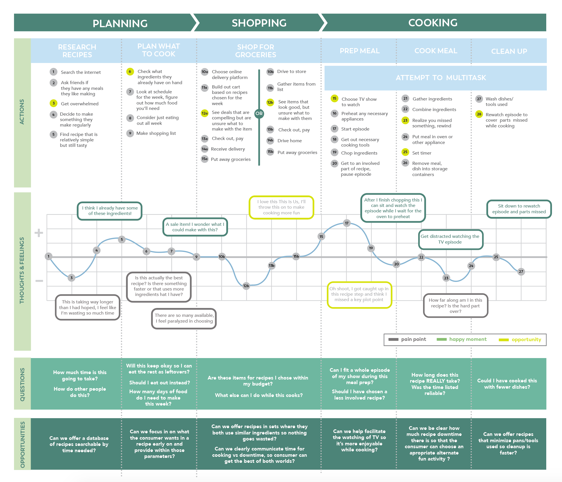
Customer Journey
Mapping out the user experience helped us identify clear pain points and opportunities. Largest findings came from the user attempting to multitask - adding an additional activity into the cooking mix was often intended to alleviate the stress of it, but in actually often added stress. Neither activity received the full focus, especially if it was a recipe new to the home cook. Users citing TV watching found themselves rewinding their show, or having to reread the recipe after moments where one activity took focus over the other. There were also pain points around expectations of time and process. Users were frustrated at not knowing exactly how long a recipe or preparatory step would take before committing to it.
Wireframe App Flow
We roughly blocked out a flow for how the user would interact and move through the app, remaining mindful of simplicity and clarity of CTAs.

Wireframe Sketches
With a clear idea of the flow, we started sketching out solutions to help work out the best way to guide users through the app. As we sketched, the following key features were kept in mind:
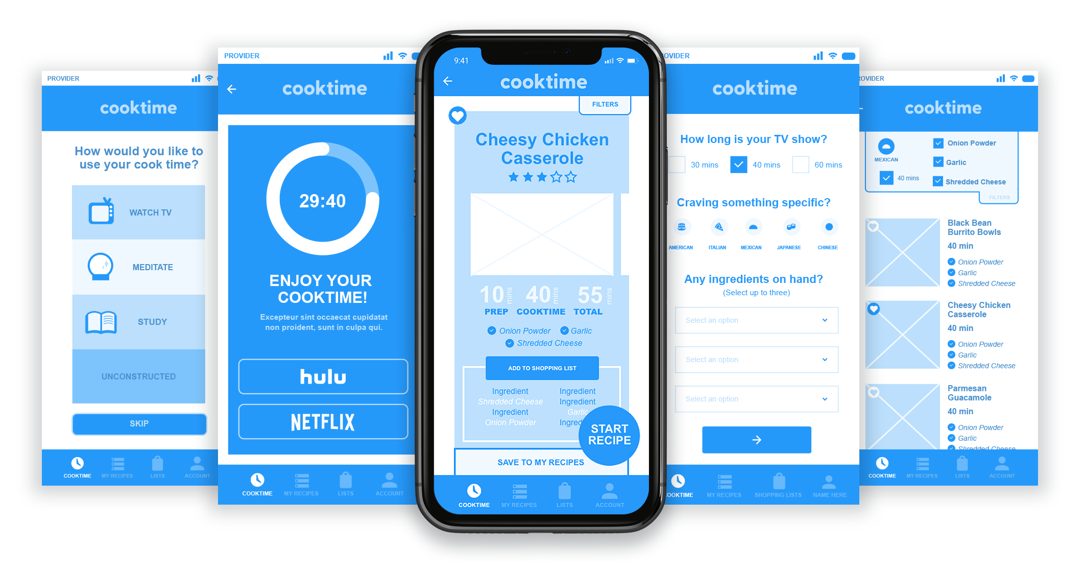
Ability to choose how much downtime you want during cooking
This allows the user to cater to their preferences, as well as be sure their multitasking is focused and optimized.
2. Ability to refine filter of recipes by ingredients on hand
According to our research, ingredients already on hand was a key factor for the majority of people in searching for a recipe. Adding the ability to refine by what’s already on hand further allows users to cater their recipe search to their individual needs.
3. Voice commands in active recipe state
We added voice commands for progressing through recipe steps. This would keep potentially messy hands free and available during prep and cooking, allowing more seamless interaction with the app.

Mid-Fi Wireframes
These wireframes, refined from the feedback in the lo-fi sketches focused on bringing additional clarity to the user.
Our main differentiator and focus became cooktime, knowing that over 90% of users listed this as a top factor in deciding what to cook. We skewed this from a potential limitor to a benefit, allowing the user to choose how to use their time.
Knowing ingredients on hand was a top 3 factor in recipe choice for users, we were sure to intentionally build this functionality into the app. At the start of each search, the user is prompted to optionally enter up to 3 ingredients they already have on hand, which both filters the recipe results to skew towards options including these items, as well as gray the items out when adding the recipe to your shopping list, keeping track for the consumer so they won’t be led to purchase what they already have on hand.
Voice commands were added to allow for a seamless experience during prep. With their hands busy prepping and potentially covered in food, this allows the user to move through the recipe steps without getting food on their device or having to pause. We worked to include clear instructions for this portion, knowing the consumer may not be familiar with this feature.
Prototype Videos
Below are prototype videos showcasing three portions of the app - onboarding, searching for a recipe and starting a recipe. These videos will help you get a sense of app flow and direct experience.
Onboarding
Recipe Search
Recipe Start
User Testing and Learnings
In order to validate our solutions, we did some user testing on our prototypes. There were a few areas that didn’t perform as we’d hoped, and these insights led us to reiterate some screens and interactions. Below are a few before and after visuals showing how we adjusted based on the user feedback:
1. START RECIPE BUTTON
Users were having trouble finding the start recipe button, which blended in. We moved it to a more prominent standout shape and simplified some surrounding communication.
2. PROMPT TO RATE RECIPE
Recipe rating function originally lived at the end of cooking, which was too soon for users to know if they enjoyed it. We moved the rating prompt to a modal pop-up at their next app login for more accurate feedback and increased user participation.
3. SIMPLIFIED SHOPPING LIST INTERACTION
Shopping list viewing page was clunky, and required multiple clicks to view the list. We simplified to a single click to view, with editing options grouped into one section.
Project Learnings
This project was a great reminder that there are endless possible solutions to a problem. At first glance it felt like the cooking/recipe app space was really saturated, and I wasn’t sure what we would be able to bring to the table here. However, through staying true to the user and conducting thorough research and observation, we were led to a white space. From there we were able to come up with an offering that brings both practicality and fun.