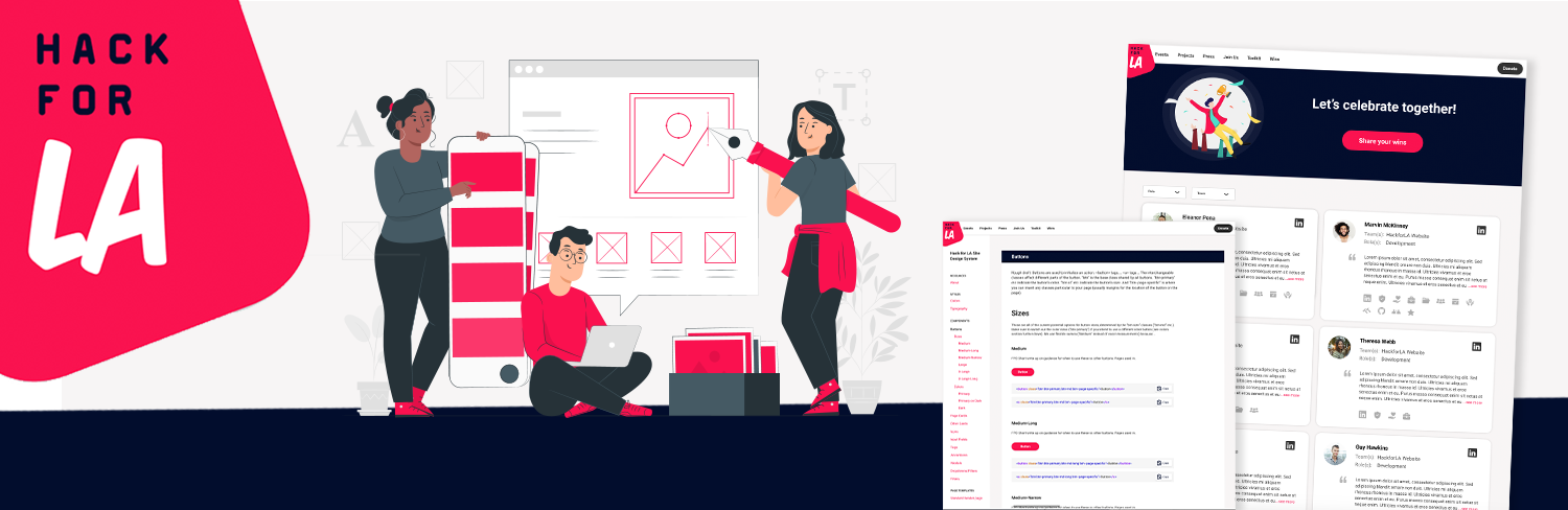
HACK FOR LA WEBSITE & DESIGN SYSTEM
Developed wireframing and prototypes driven by research findings for a redesign of the Hack for LA website aiming to increase volunteer participation and simplify onboarding. Key contributor in designing the site to house our newly created design system, enabling widespread visibility and more consistent use of components across the organization.
CLIENT Hack for LA / ROLE UX/UI Designer / Spring 2021 / DURATION 5 weeks
Problem Space
The Hack for LA organization website was no longer optimized for its various users. Influx of new volunteers had decreased, and our research showed that our main page was not showcasing the breadth of the program, or clear steps on who could join and how to get involved. While the organization depends on its various types of members - donors, longtime members, and new volunteers, our team’s focus was to increase new membership and make the onboarding process more smooth and efficient.
PROBLEM SPACE: New interested volunteers need a homepage that explains our mission, shows clear steps on how to get involved, and provides the tools needed to onboard efficiently.
Key Opportunities & Goals
Here are the four key problems identified in the research, as well as the subsequent goals we aimed for to solve for them:
KEY PROBLEMS
1. Interested potential new members were often not clear on if their individual skill was something Hack for LA could use
2. A lag or total dropoff between new members attending onboarding meetings and getting fully involved in their Community of Practice
3. Showcasing a lengthy outdated project list was overwhelming and driving some false interest
4. The homepage wasn’t fully showcasing the breadth of experience, community support, and impact that our organization has to offer
OUR GOALS
1. Increase clarity on who and what skills are welcome at Hack for LA, be louder about our inclusivity!
2. Clearer next steps, decrease friction between onboarding meetup and getting into your CoP
3. Delegate less real estate for current projects, find better ways to drive engagement or spark interest
4. Highlight Community of Practice benefits, volunteer experience wins, and recent press
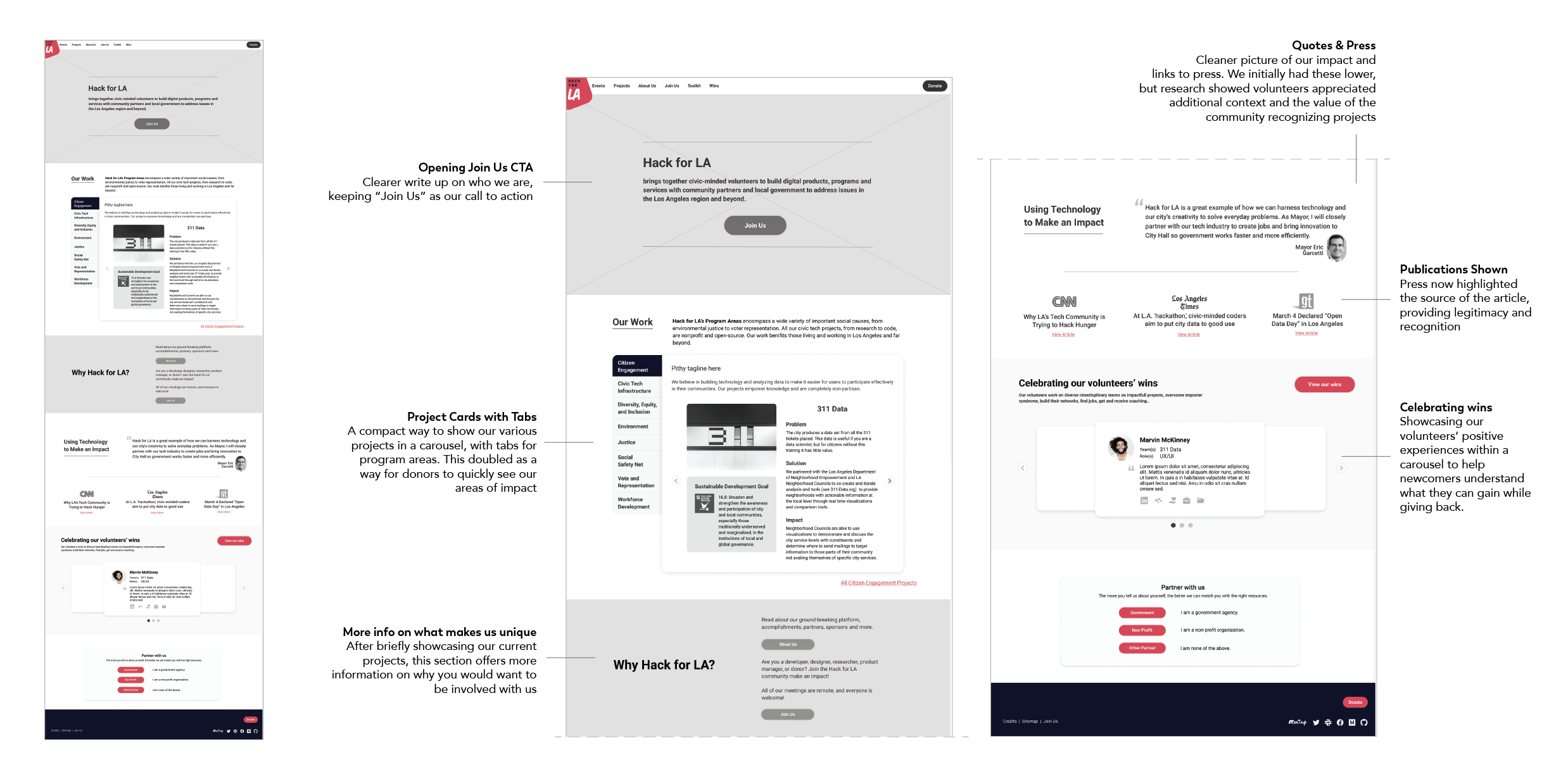
Current Homepage Layout
The current homepage offered minimal information on who Hack for LA is, what we do, and who can get involved. The project list was lengthy with many outdated projects no longer accepting new volunteers, and very few people were scrolling far enough to see our press highlights and additional links on how to volunteer with us.
User Testing and Learnings
With a clearer picture of what was missing and what we wanted to showcase, our team dove into some quick wireframes exploring various ways to communicate our key information. We walked through various combinations of these explorations with users at different stages of their volunteer onboarding to get feedback and clarity on what information they were looking for.
KEY RESEARCH FINDINGS
1.. Some people were ready to click that first “join us” CTA, but others were more likely to click further down after seeing more info and context about the opportunity
2. New volunteers were not clear on what Communities of Practice are
3. ”What is HfLA?” was the number one piece of information new volunteers were looking for on our homepage, followed by project descriptions and program areas
Mid-Fidelity Site Layout
Taking into consideration our volunteer feedback, we dove into a more complete look at how to best use our home page’s real estate in support of our user. A few of our solves and the goals they supported included:
Bumping the volunteer with us section much higher up, and including multiple entry points to getting started (Goal 2)
2. Opening with a clearer explanation of what Hack for LA is and what we do (Goal 1, 3)
3. Compressing the current project section and categorizing by program area (Goal 3, 2)
4. Showcasing a carousel of volunteer wins, leading to our wins page to help volunteers understand what they can get out of the experience of working with us (Goal 1, 4)
5, Provide more information on our Communities of Practice, supportive communities within our organization built around the specific skillset you want to contribute - UX/UI, Developers, Researchers, etc. (Goal 1, 2, 4)
Creating Easier Access to Tools

With a clearer home page helping guide volunteers to our organization, we still faced the challenge of volunteers getting lost between orientation and fully onboarding into their Communities of Practice on GitHub. Our research showed lots of people made it to the slack channel thinking they were finished. Even once given access to a community GitHub, volunteers weren’t always finding it or participating fully. Each Community of Practice has its own GitHub page in addition to our main organization materials, adding a potential extra layer of confusion.
Knowing new members were at least clear as to what their skill and CoP was from the onboarding meeting, we decided to leverage that certainty and flow the resources from there. Our new homepage would offer a clear link to the CoP page and where GitHub links were added for each group. This way, at the end of onboarding, we could direct all new members collectively to this one page regardless of their CoP, and they could quickly find both the Slack channel as well as the GitHub page for their specific community group. This process is simpler for new members who can now self select what they need, as well as for onboarding leaders who have a universal link for all new members. This also has the added benefit of doubling as an access point for existing volunteers looking to find their community page as needed.

Design System Website Layout
To both eliminate unnecessary work and increase asset consistency across the organization, an inventory was done on all components which were then standardized into what is now our design system. In order to create easy access across all teams, we worked to create a website for our system where all contributors could easily reference or pull code from one central place. With our system built out and usable within Figma as well, we can easily be sure all instances in prototypes and layouts are updated as the system continues to be improved and evolved.
